meta name="naver-site-verification" content="ae4cae44dcaf70f327af01a4817e8b3936153eaf" / 맞춤형 여행의 시대: 변화하는 여행 트렌드 공유
본문 바로가기
카테고리 없음

맞춤형 여행의 시대: 변화하는 여행 트렌드 공유

by 천하태평 ㅎㅎ 2025. 6. 25.


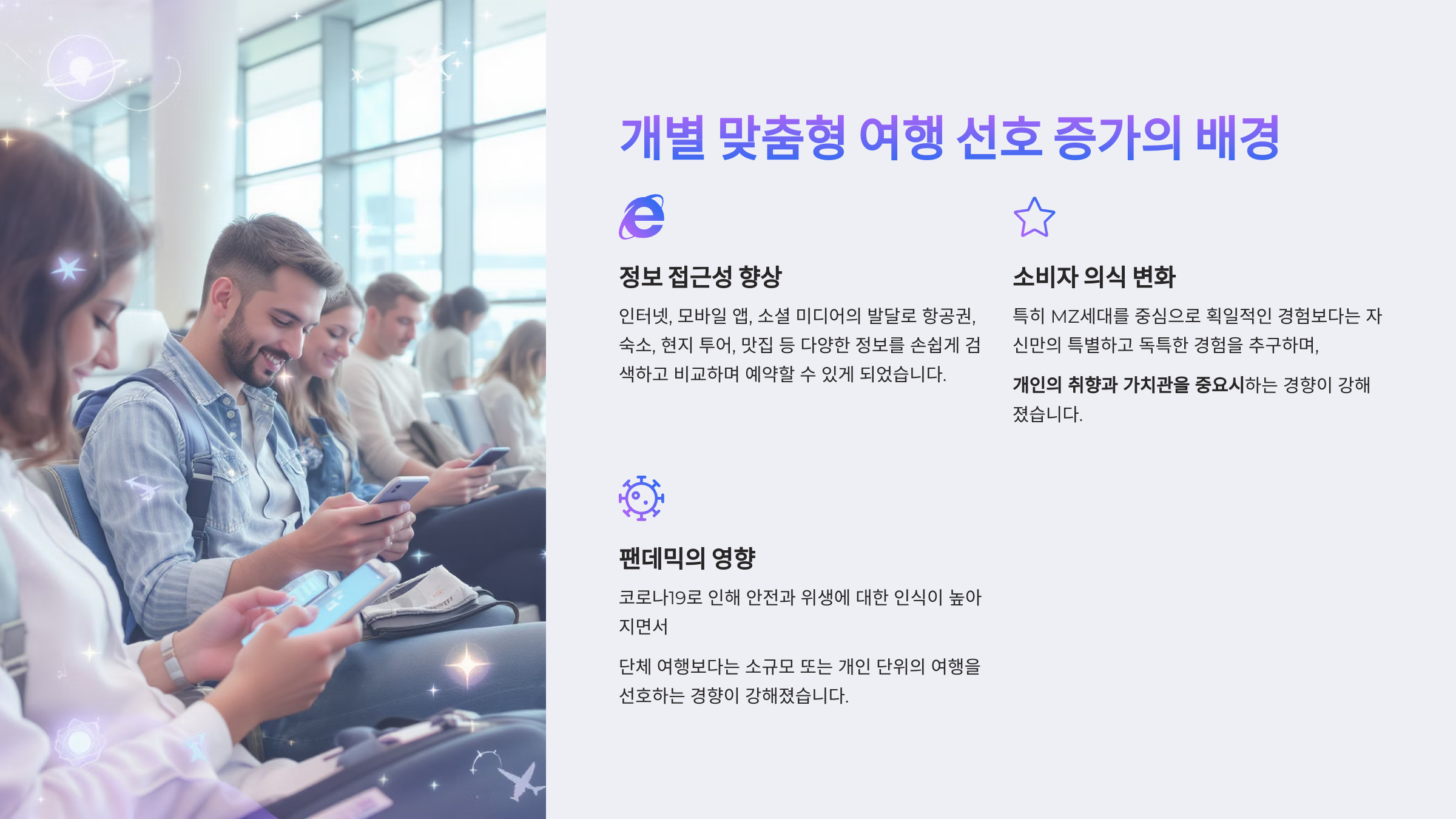
언제부터인가 우리 사회가 1인세대라는 단어가 등장하자마자

혼밥의 세대가 등장했는데 이제는 여행도 개별 맞춤형 여행의

트렌드로 바뀌고 있다

그만큼 인간적인 면이 개인주의로 바뀌고

자기만의 자유를 찾는 트렌드로 변화하는

사회적 개인의 가치기준이 변화 하고 있다고 본다
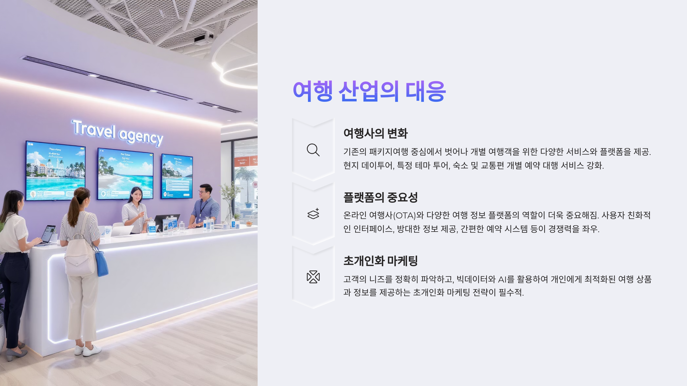
이것이 현실이고 현실은 받아들이고

현실에 맞게 사회 시스템이 바뀌는 것은 당연한 것이다

어쨌든 여행에서 가장 중요한 것은 안전이다

모두가 혼자든 단체든 안전한 여행 후에

자신의 새 삶을 살아 갈 수 있는 준비와 결과가 중요하다


._my-button { /* 위 아래 거리 */ margin-top: 30px !important; margin-bottom: 30px !important; /* 글자 크기 */ font-size: 25px !important; /* 글자 굵게 (사용한 폰트에 따라 적용이 될 수도 안될 수도 있음) */ /* 100 ~ 900 (일반적으로 500) */ font-weight: 700 !important; /* 가로 크기 */ /* 글자 크기만큼 줄이려면 fit-content */ width: fit-content !important; /* 버튼 안의 상하 / 좌우 여백 */ padding: 12px 50px !important; /* 글자색 */ color: white !important; /* 배경색 */ background-color: rgb(255, 69, 69) !important; /* background: linear-gradient(to right, rgb(88, 166, 255), rgb(117, 67, 255)); */ /* 테두리 */ border-style: solid !important; /* 모양 */ border-width: 4px !important; /* 두께 */ border-color: rgb(202, 77, 77) !important; /* 색깔 */ /* 글자에 밑줄 넣을지(underline), 말지(none) */ text-decoration: none !important; /* 테두리 둥근 정도 */ border-radius: 100px !important; /* 애니메이션 동작 */ transition-duration: 0.3s !important; /* 버튼 그림자 */ box-shadow: 2px 4px 6px rgba(0, 0, 0, 0.4) !important; /* 텍스트 그림자 */ text-shadow: 2px 4px 6px rgba(0, 0, 0, 0.2) !important; ._my-button { /* 위 아래 거리 */ margin-top: 30px !important; margin-bottom: 30px !important; /* 글자 크기 */ font-size: 25px !important; /* 글자 굵게 (사용한 폰트에 따라 적용이 될 수도 안될 수도 있음) */ /* 100 ~ 900 (일반적으로 500) */ font-weight: 700 !important; /* 가로 크기 */ /* 글자 크기만큼 줄이려면 fit-content */ width: fit-content !important; /* 버튼 안의 상하 / 좌우 여백 */ padding: 12px 50px !important; /* 글자색 */ color: white !important; /* 배경색 */ background-color: rgb(255, 69, 69) !important; /* background: linear-gradient(to right, rgb(88, 166, 255), rgb(117, 67, 255)); */ /* 테두리 */ border-style: solid !important; /* 모양 */ border-width: 4px !important; /* 두께 */ border-color: rgb(202, 77, 77) !important; /* 색깔 */ /* 글자에 밑줄 넣을지(underline), 말지(none) */ text-decoration: none !important; /* 테두리 둥근 정도 */ border-radius: 100px !important; /* 애니메이션 동작 */ transition-duration: 0.3s !important; /* 버튼 그림자 */ box-shadow: 2px 4px 6px rgba(0, 0, 0, 0.4) !important; /* 텍스트 그림자 */ text-shadow: 2px 4px 6px rgba(0, 0, 0, 0.2) !important; display: flex !important; justify-content: center !important; align-items: center !important; margin-left: auto !important; margin-right: auto !important; cursor: pointer !important; opacity: 1 !important; transition-property: all !important; line-height: 1.5 !important; text-align: center !important; white-space: nowrap !important; overflow: hidden !important; } ._my-button:hover { transform: scale(1.2) !important; background-color: rgb(96, 170, 255) !important; border-color: rgb(74, 143, 223) !important; } Box Shadow 꾸미기 사이트 https://getcssscan.com/css-box-shadow-examples